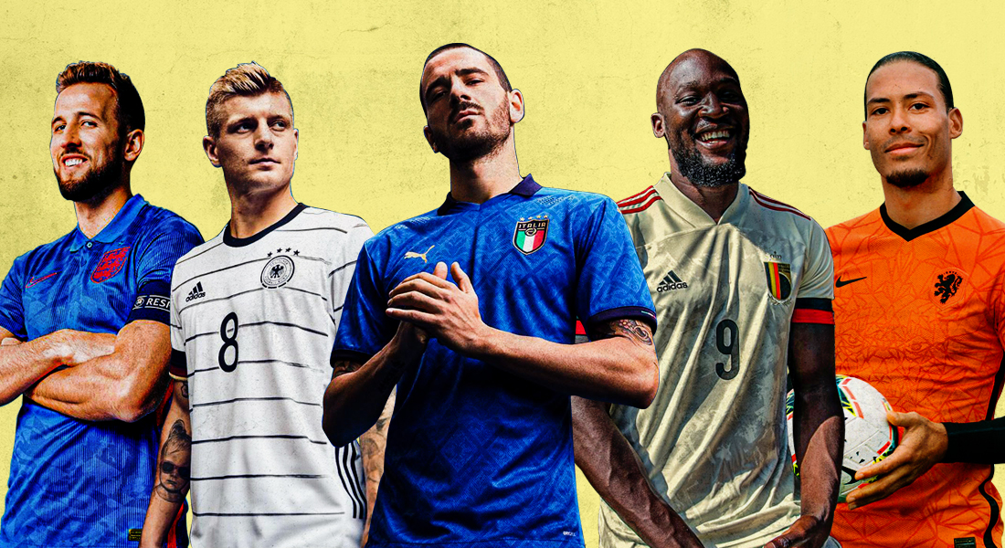
Arguably the most contentious continental competition is out there and we’re more than ready for kick-off. But we’re also excited for the game within the game.
With the delayed Euro 2020 (2021?) around the corner – with less than 3 months remaining for the iconic tournament to be staged, the world’s kit manufacturers finally dropped the last of the Euro kits. And FootTheBall are here to take a look at the best and worst offerings.
Yes, it’s about winning on the pitch, but it’s also about winning the fashion game off of it too. Along with the Euro Jersey sneak peek, we also rate them as HIT or MISS.
GROUP A: TURKEY, ITALY, WALES, SWITZERLAND
TURKEY
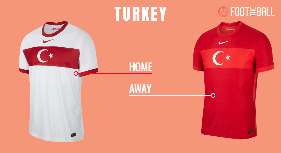
The Turkish national jersey for Euro 2020, looks a bit on the conservative side, with Nike’s latest approach might raise a few eyebrows amongst the Turkish fans.
Verdict: MISS
ITALY
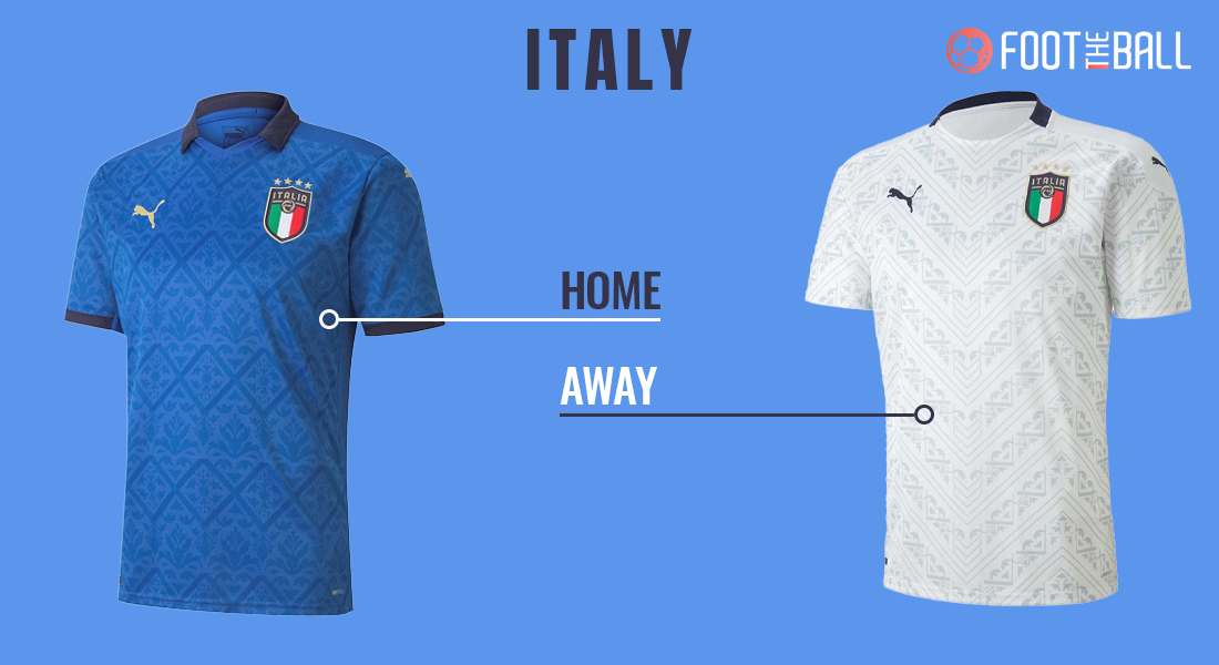
Puma has put in a lot of effort on the Italy kit for Euro 2020 and that is visible with their latest edition which is quite artsy and fashionable.
Verdict: HIT
WALES
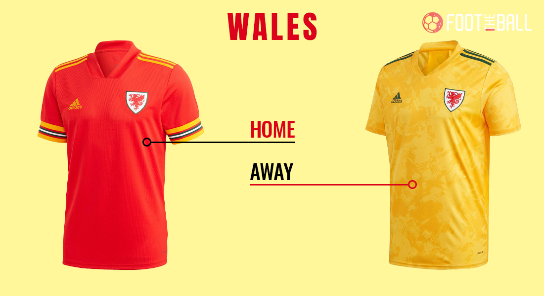
Adidas’ inconsistent and plain design for Wales’ Euro 2020 home kit would not go well with football kit fans. Whereas, stripes on the away kit gives a good touch overall.
Verdict: MISS
SWITZERLAND
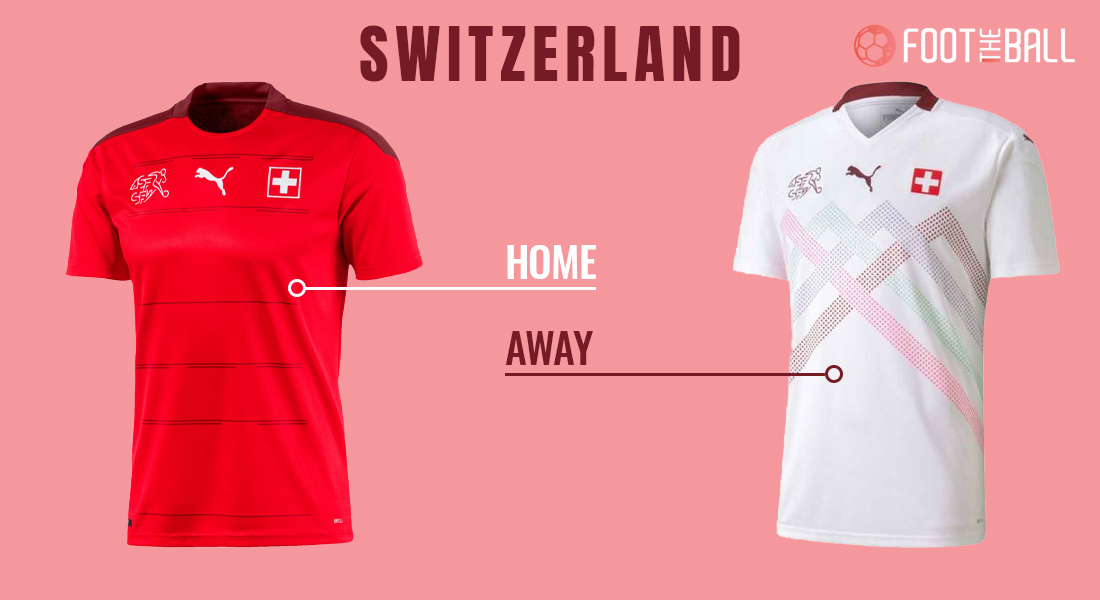
Yet another masterclass from Puma where a fantastic design for both home and away kits for Switzerland’s Euro 2020, which resembles mountain ranges of Switzerland, with a balanced contrast and design.
Verdict: HIT
GROUP B: DENMARK, FINLAND, BELGIUM, RUSSIA
DENMARK
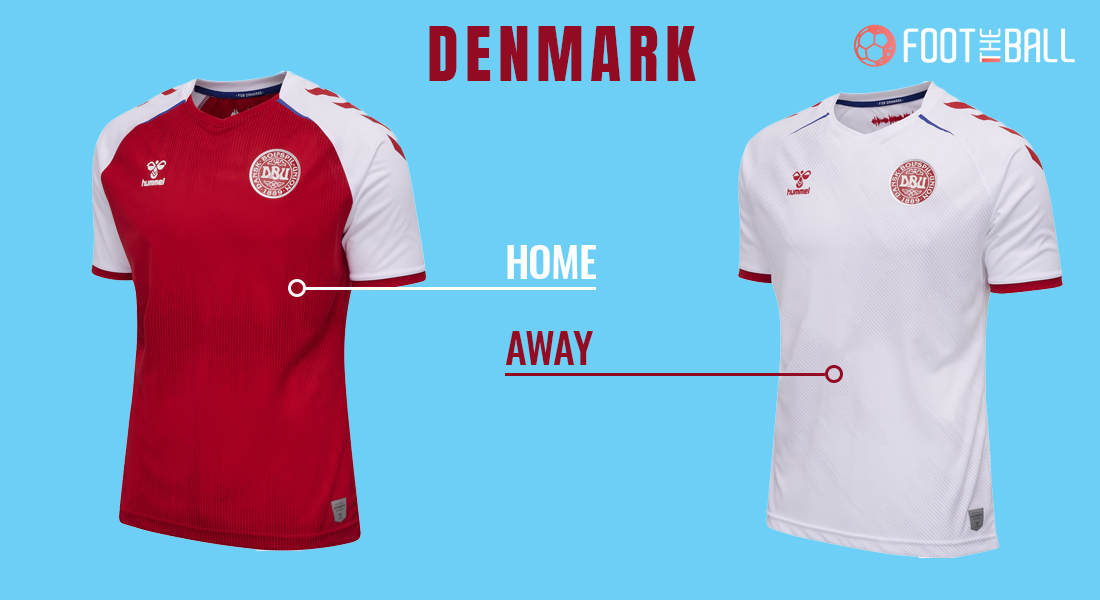
Simple and well-executed in terms of shoulder patches – with a dash of blue on either jersey brings out beauty of the kit.
Verdict: HIT
FINLAND
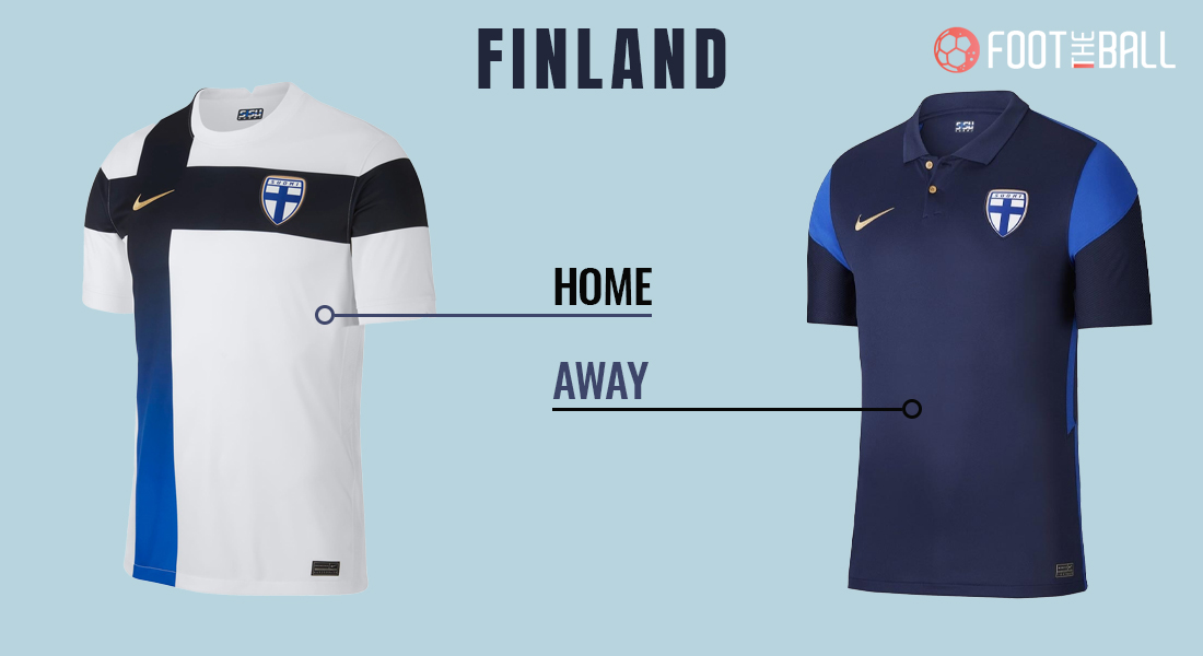
Finland’s away kit looks like a Polo T-shirt – with buttons on the jersey could possibly backfire with fans. The home jersey gradient stands out but doesn’t do enough to make up for the misses on home jersey.
Verdict: MISS
BELGIUM
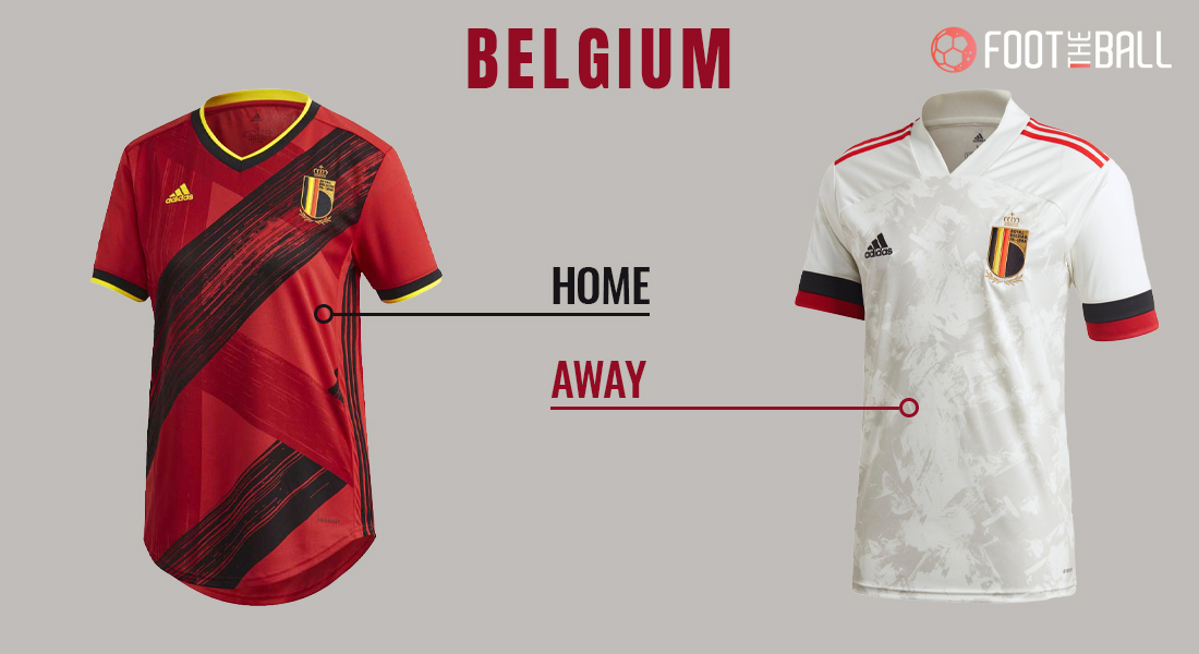
The brush strokes on the home kit is a nice idea but could’ve been slightly sleekier, whereas, away has a nice European touch to it.
Verdict: HIT
RUSSIA
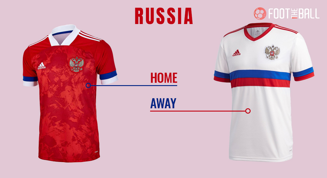
Russia’s away jersey looks more like a school uniform but the home kit has great irregular brush strokes with a stretched collar design that is compelling to wear.
Verdict: MISS
GROUP C: NETHERLANDS, UKRAINE, AUSTRIA, NORTH MACEDONIA
NETHERLANDS
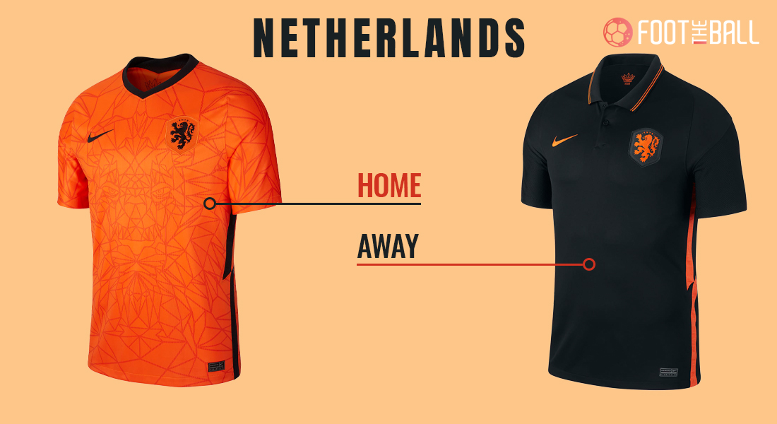
Nike’s gothic lines and patterns on the home kit with slit open side dash, combined with the collared jersey and double stripes on it is a bold move.
Verdict: HIT
UKRAINE
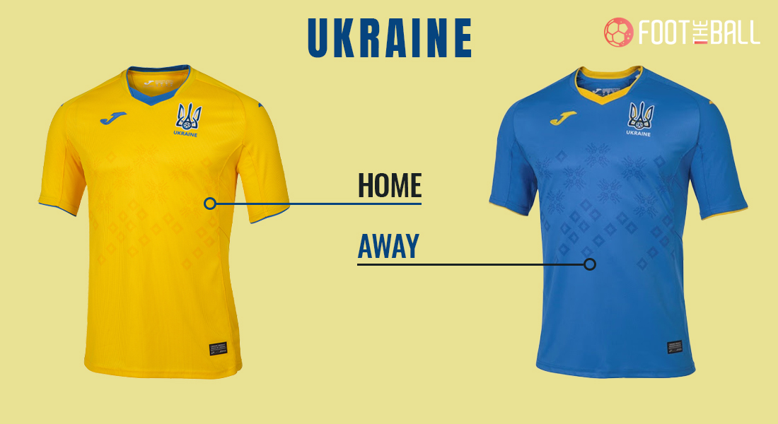
With the home kit of Ukraine for Euro 2020, the yellow design is not quite visible which does not make it a good choice, although, the wingspan design on the collar is a good touch and a saving grace.
Verdict: MISS
AUSTRIA
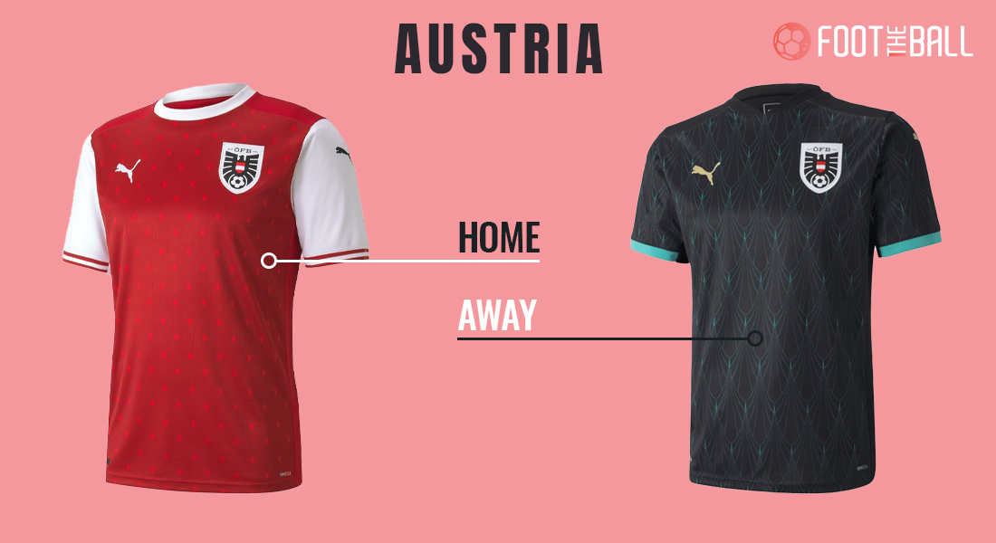
Austria’s Euro 2020 home kit, looks more like an Arsenal jersey, which marks it as lazy work and Puma running out of ideas, whereas, the away kit makes up for the blunder of a home jersey.
Verdict: MISS
NORTH MACEDONIA
Euro 2020 kit for North Macedonia will be launched soon.
GROUP D: ENGLAND, CROATIA, SCOTLAND, CZECH REPUBLIC
ENGLAND
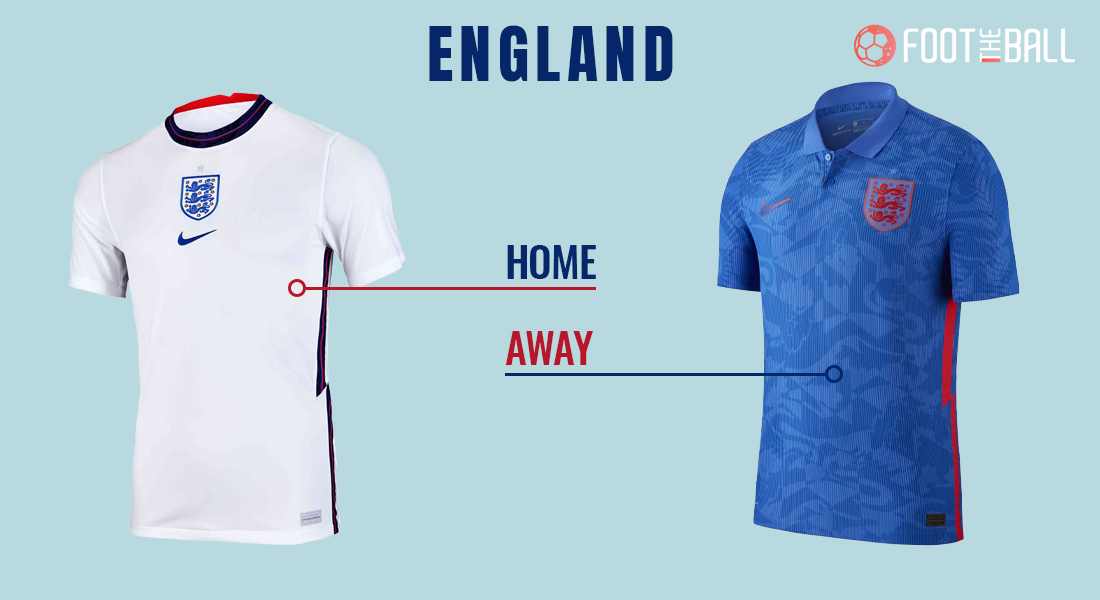
Nike, like most of its Euro 2020 kits, have followed a slit open side pattern, which whilst looks good, but shows lack of creativity. The 3 lions dispersed pattern in away jersey, even though a good idea, looks a tad crowded.
Verdict: HIT
CROATIA
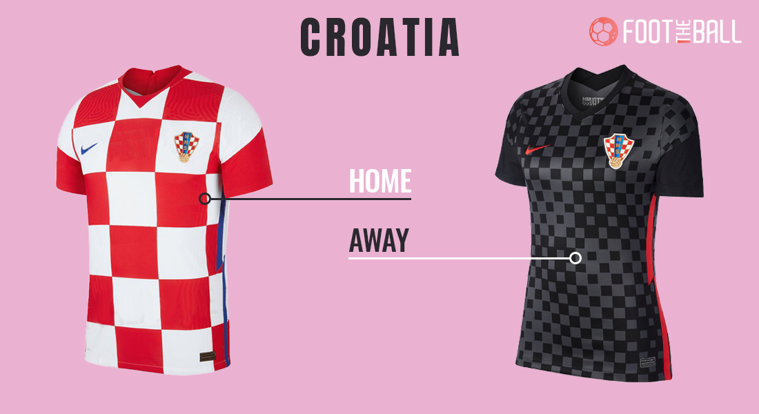
Nike for all its great work overall, the Croatia Euro 2020 kit feels unchanged for ages and the away kit is very similar to Liverpool’s 3rd kit.
Verdict: MISS
SCOTLAND
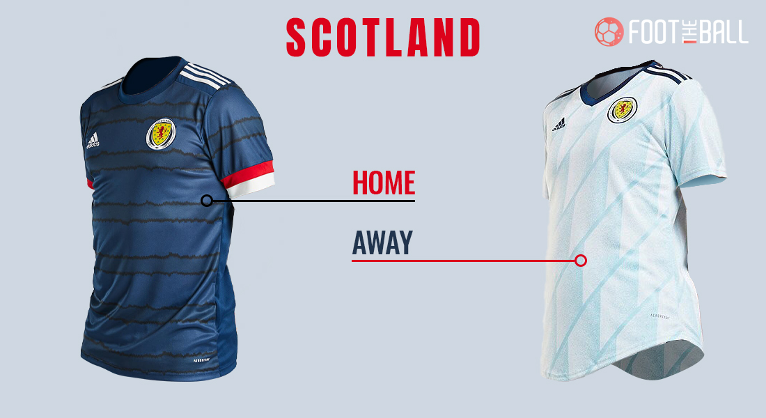
Scotland’s Euro 2020 home kit has those unique wave forms which looks intriguing and the away frozen mirror look and feel complements the Scottish weather well.
Verdict: HIT
CZECH REPUBLIC
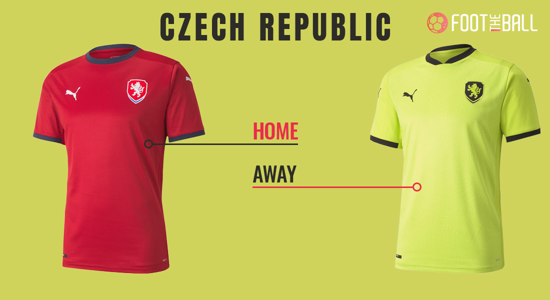
Not many efforts put here on Puma’s behalf with both the home and away kits look very basic AF!.
Verdict: MISS
GROUP E: SPAIN, SWEDEN, POLAND, SLOVAKIA
SPAIN
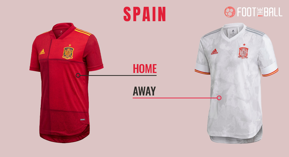
While the home kit is brilliant as it is, the away kit is very similar to that of Belgium – lazy from Adidas.
Verdict: MISS
SWEDEN
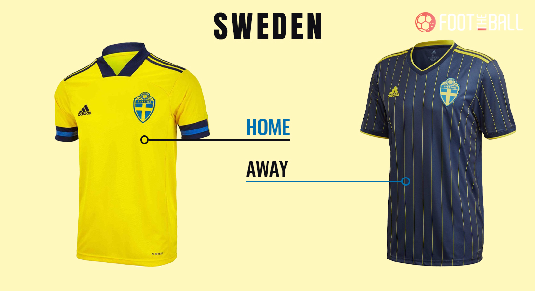
Sweden’s away jersey is the best of the lot, whereas, the home jersey is as basic as it gets.
Verdict: HIT
POLAND
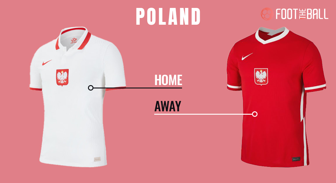
The alignment with the Polish logo and Nike logo here is odd, also the Polish classic style is retained.
Verdict: MISS
SLOVAKIA
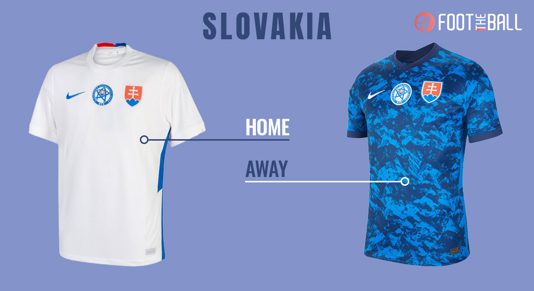
The away jersey looks like beachwear here for Slovakia’s Euro 2020 kit, whereas, the home kit is bland when compared to the away jersey.
Verdict: MISS
GROUP F: HUNGARY, PORTUGAL, FRANCE, GERMANY
HUNGARY
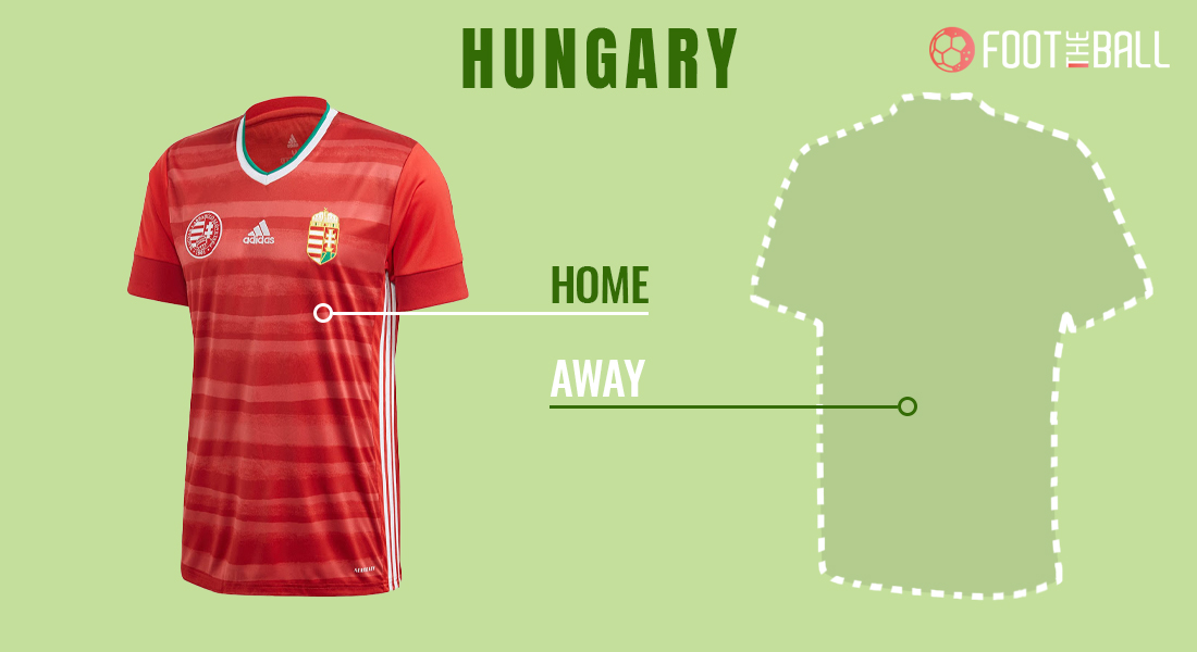
Hungary’s home jersey looks like some sort of ketchup smeared all over it. The away kit will be launched soon.
Verdict: MISS
PORTUGAL
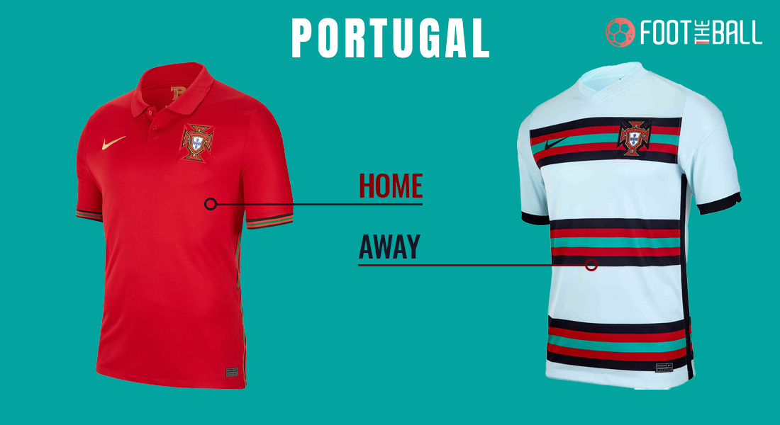
Portugal’s away kit, while bold, seems like Nike have over done it, whereas, the alignment of the Portugal Logo and Nike logo is perfect on the home kit when compared to that of Poland.
Verdict: MISS
FRANCE
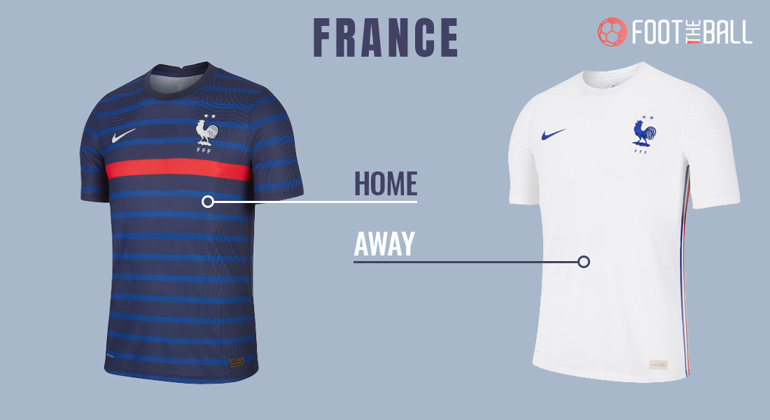
France’s Euro 2020 home kit looks like a prison outfit, but the away kit has a French flag dash on the sides which is a relief to kit lovers.
Verdict: HIT
GERMANY
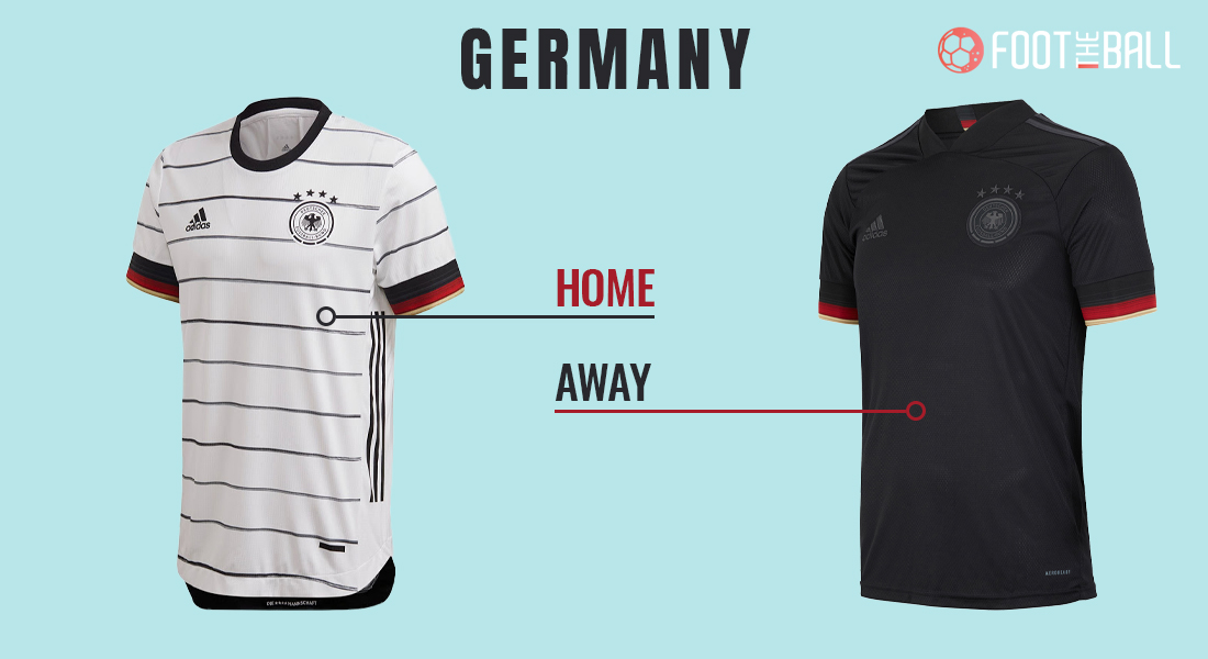
Germany’s home Euro 2020 kit is a notch down from their previous versions, while away kit has a unique feel to it because of its much unique collar.
Verdict: HIT

